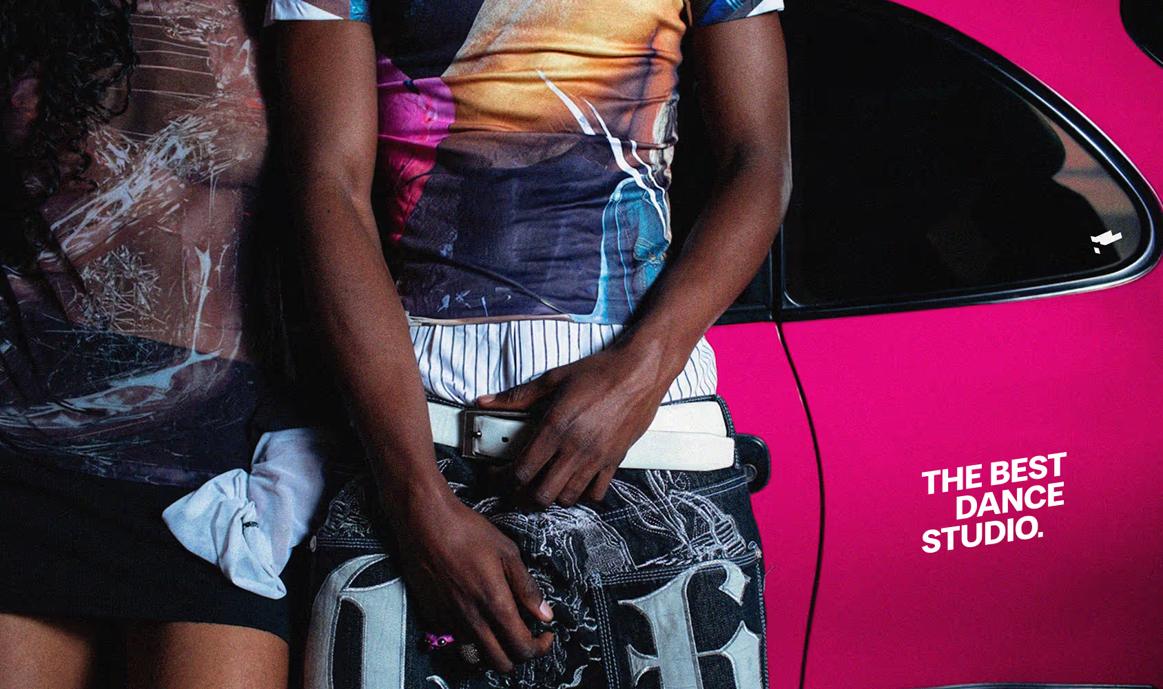
close-up of stylish people leaning on a pink car. Picture found on Death to Stock, shot by Franco Dupuy

The Playground L.A.

This project focused on redesigning the visual identity of Playground L.A., a dance studio founded by Robin Antin (Creator of the Pussycat Dolls) that offers classes taught by professional dancers and choreographers. While the studio has strong cultural visibility through viral dance videos and media appearances, its current brand identity lacks consistency across platforms.
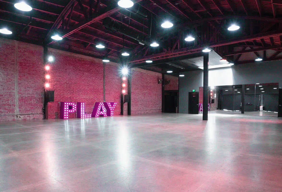
Picture of the existing inside of the dance studio. found on the website of the playground L.A. : https://www.playgroundla.dance/ourstudio
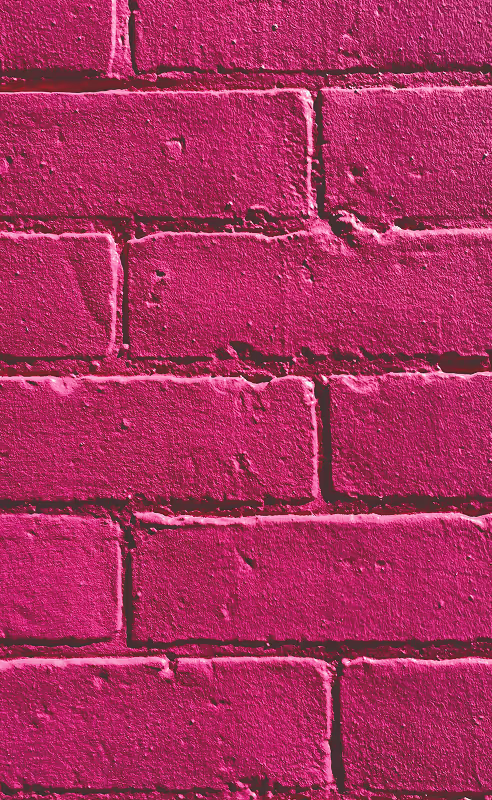
Close up of a magenta brick wall. Picture found on Unsplash, shot by Shirqille Tisi
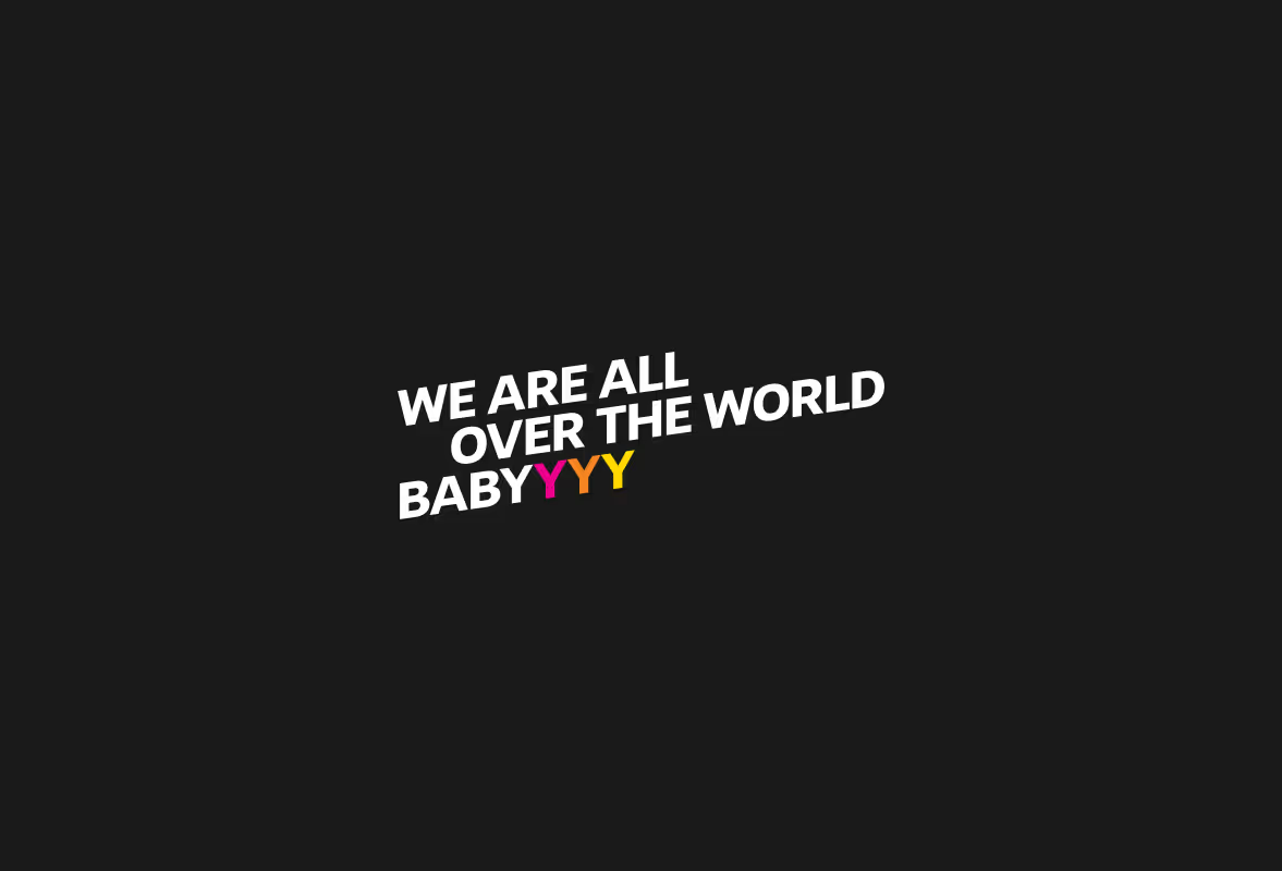
Stylized text on black background saying : "we are all over the world babyyyy"

Research focused on the visual culture surrounding the studio, particularly its strong presence on Instagram, TikTok, and YouTube. One recurring element stood out: the iconic brick wall frequently appearing in viral dance videos.

Although many viewers recognize the videos, they often do not immediately associate them with the Playground brand. This observation led to a key question: how can the identity make the studio instantly recognizable beyond the videos themselves?

The identity is built around a typographic reinterpretation of the studio’s name. The logotype shortens “Playground L.A.” to “Playgrnd L.A.”, creating a sharper and more contemporary tone that resonates with Gen Z. The letters of the logo are bold and tightly kerned to echo the idea of building something “brick by brick,” reinforcing the community aspect of the studio.

A defining feature of the identity is its consistent slanted structure. The graphic system avoids horizontal lines and right angles, creating a dynamic visual language that reflects movement and growth.

The color palette centers on an intense pink, chosen for its boldness and visibility. Combined with strong color pairings and a slightly aggressive contrast, the palette reflects the confident and performative energy of contemporary dance culture. Different color combinations can also distinguish various dance styles or programs offered by the studio.

The logotype’s abstract lozenge shape also functions as a graphic element that can be repeated, scaled, or patterned throughout the brand system.

The final result is a flexible identity system designed to work across multiple touch points, including stationery, environmental graphics, merchandise, and digital platforms
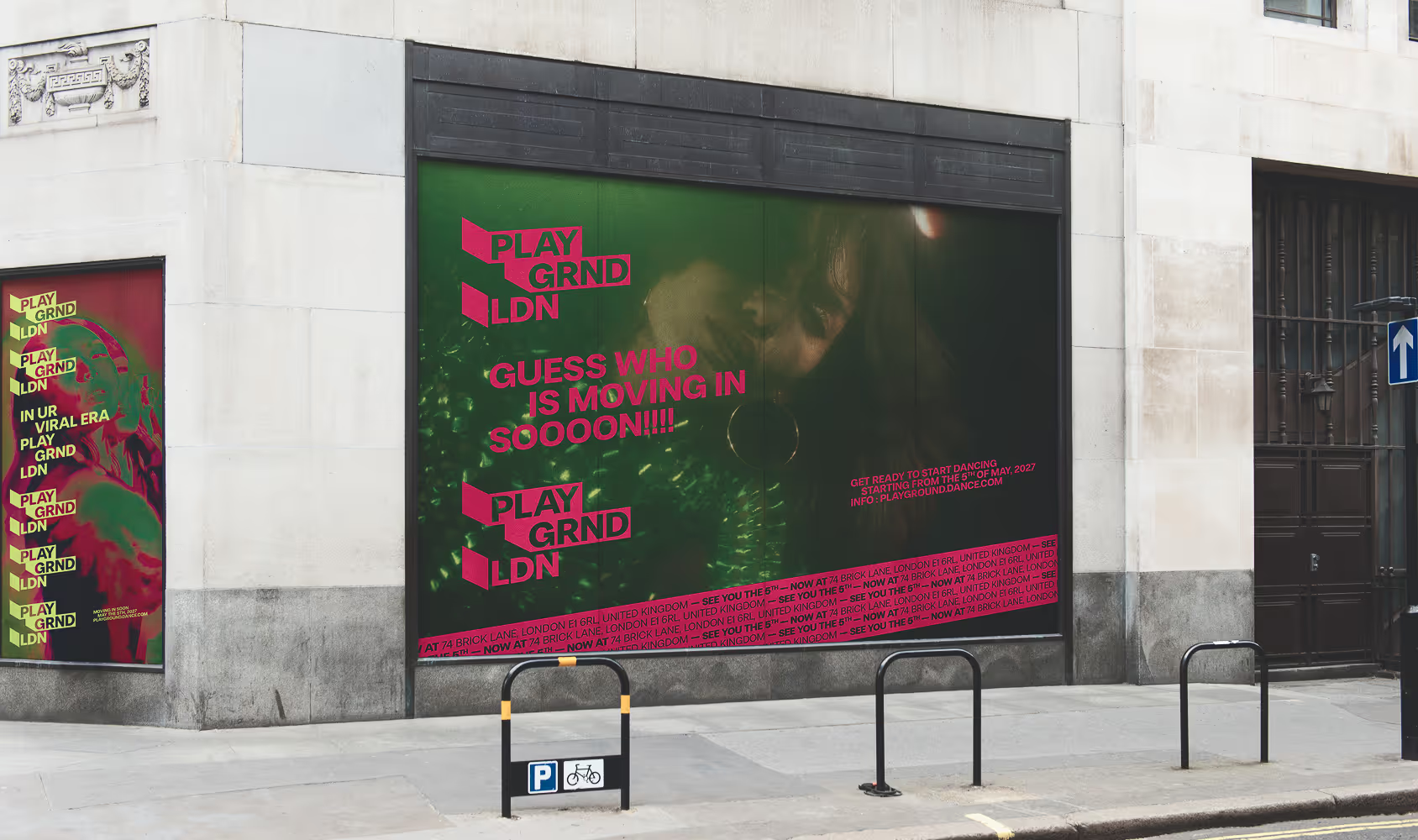
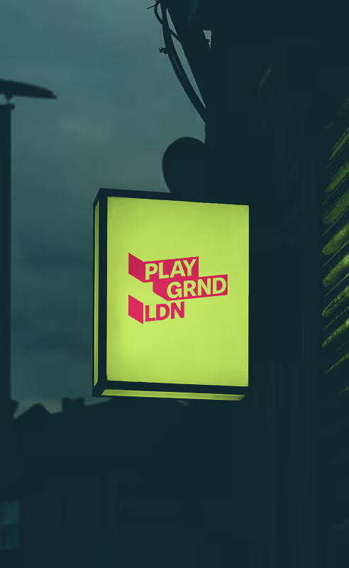
London-situated studio-front mockup with taglines such as "Guess who is moving in sooooon!!!" or "in your viral era—Playground LDN" Found; Mockup Maison
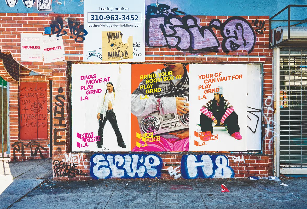
Series of L.A.-situated posters promoting the studio "your gf can wait for Playground L.A." source ; Mockup Maison
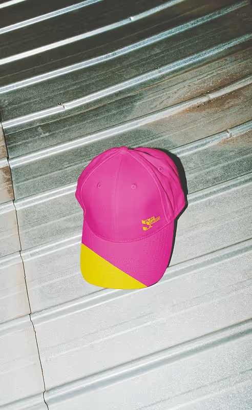
Branded Pink Cap for Playground L.A. Source ; Mockup Maison
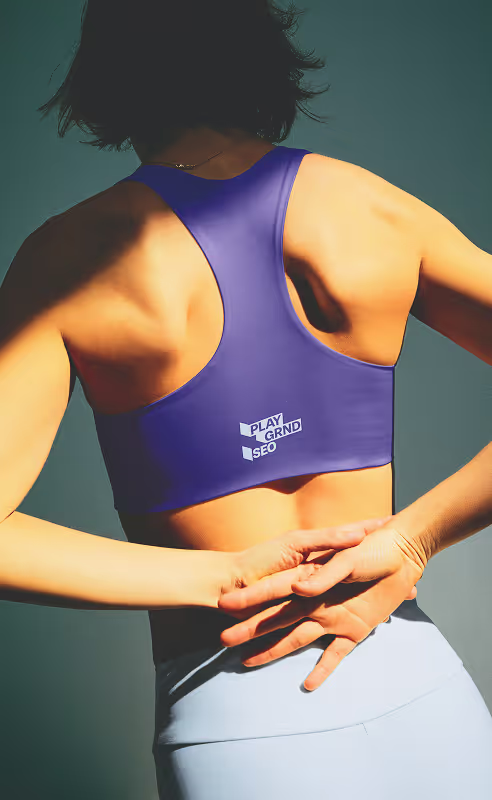
Branded Sports Bra for Playground SEO Source ; Mockup Maison
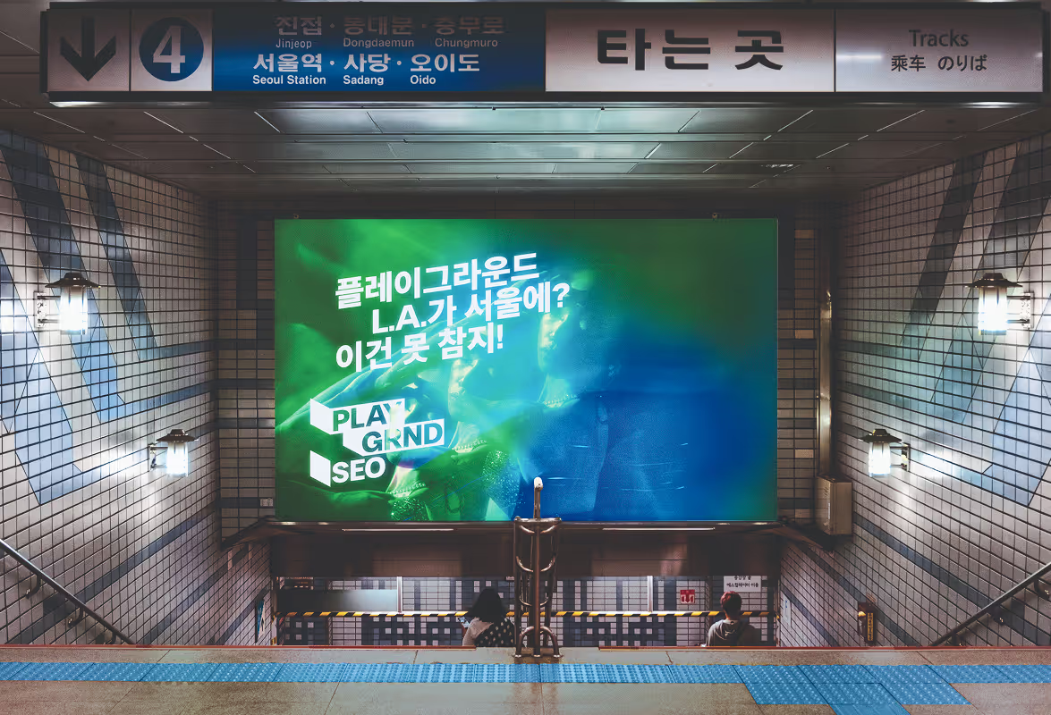
Seoul-located Mockuped Metro Add saying 플레이그라운드 L.A.가 서울에?이건 못 참지! "Playground LA in Seoul? You can’t miss this."
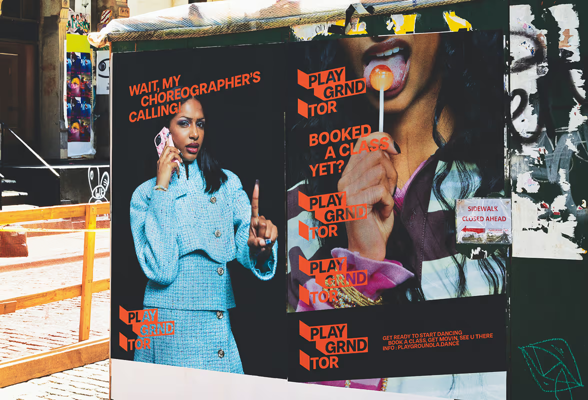
2 Toronto-based street posters — one saying "wait, my choreographer's calling, playground TOR", and the other ; "Booked a class yet?, Playground TOR" Mockup source : Mockup Maison
Mockup of potential London-based studio/storefront sign Source : Mockup Maison
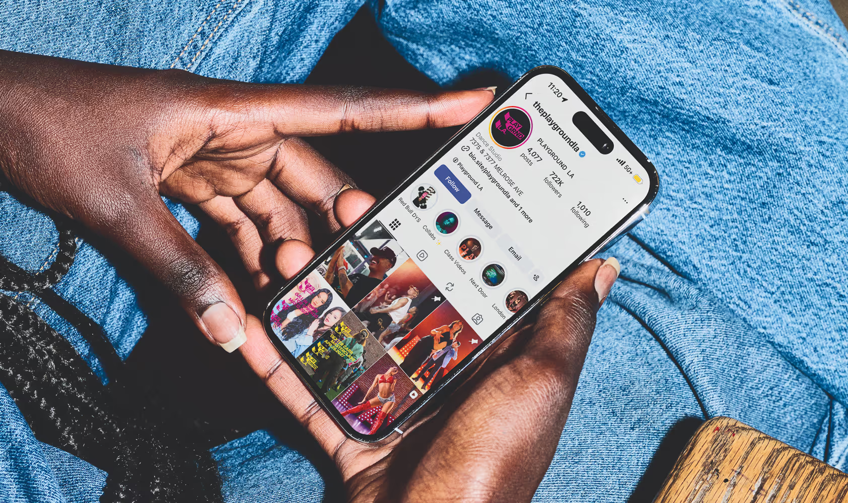
Close up of person holding phone with legs crossed. Mockup of the Playground L.A.'s instagram Page
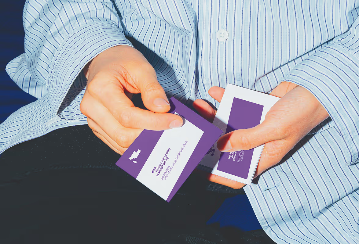
Close up of hands holding their purple and white SEOUL business cards. Source : Mockup Maison
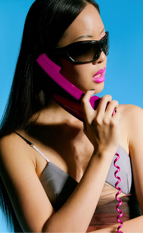
Young woman holding a pink cable phone edited by Laureline Dodin but found on Death to Stock photoshoot; NOWSTALGIA by Debora Spanhol
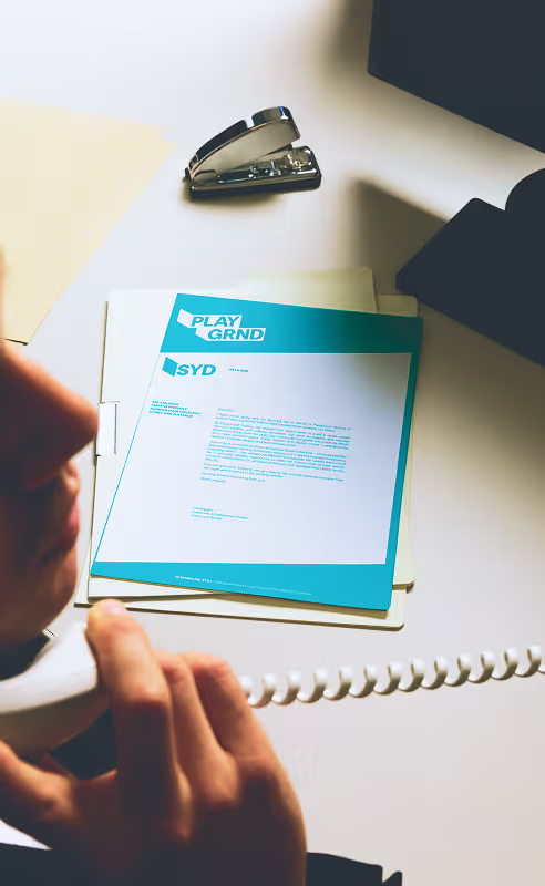
Employee responding to the phone (cable as well) with blue and white sydney (SYD) stationnery letter design on the desk. Mockup source : Bendito Mockups
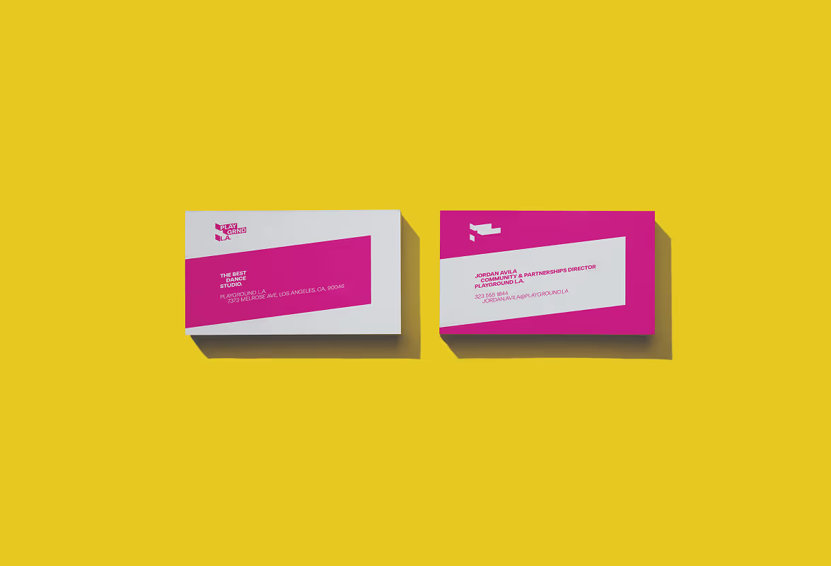
Bird's eye view of L.A. magenta and white business card on a bright yellow background. Source : Mockup Maison
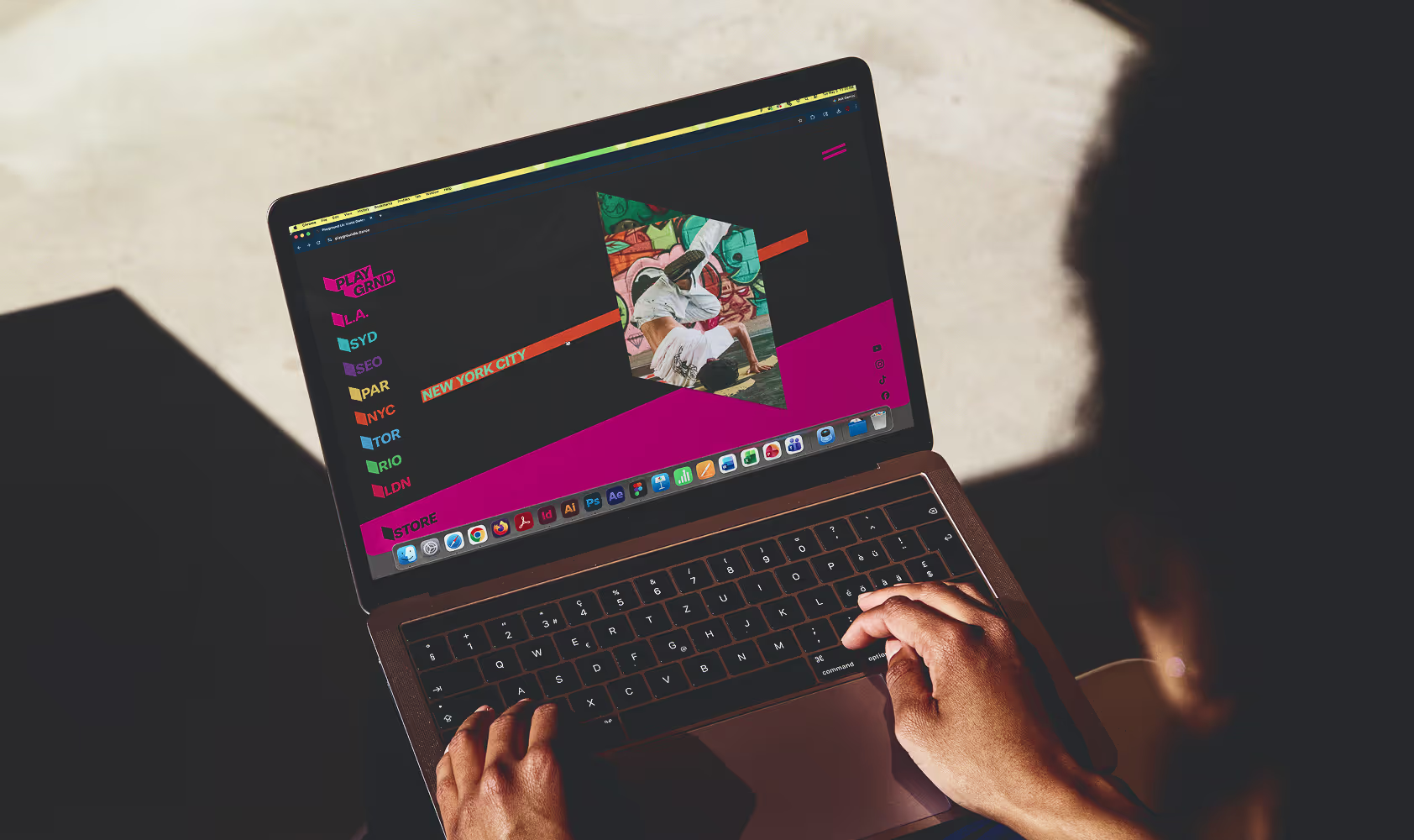
Close up of somebody visiting the potential Playground L.A. website. Source : Mockup Maison
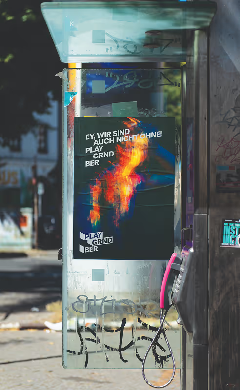
Berlin-based street poster on a public telephone station. Tagline saying " Ey, wir sind auch nicht ohne! Play Grnd Ber" (Hey we're not too bad at this) Source : Mockup Maison
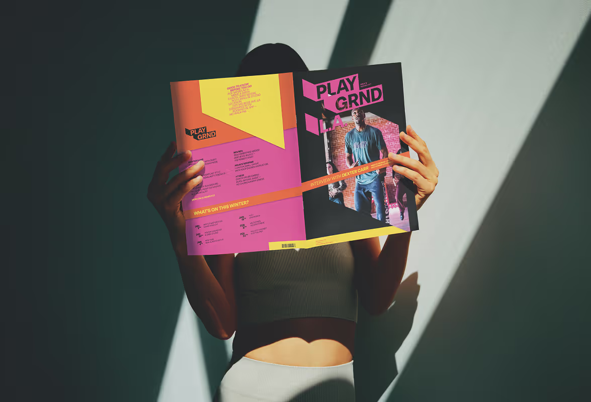
Woman holding a Playground L.A. magazine which hides her face. Shadows highlight the publication. Source : Mockup Maison
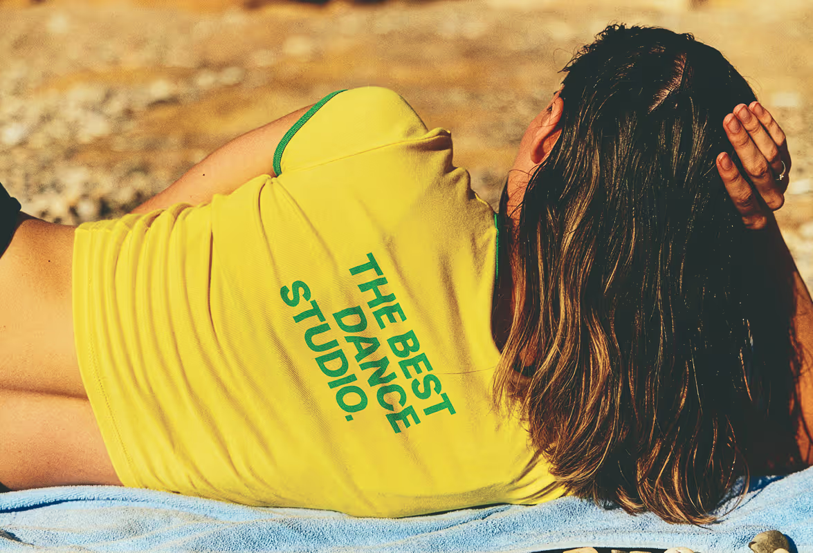
Edited picture of a woman's yellow and green t-shirt with added branded tagline saying "the best dance studio." Found on Death to Stock "my own summer" shot by Daniel Farò
Context picture of strong waves. Found on Death to stock Photoshoot : la calma, shot by Parole Dure
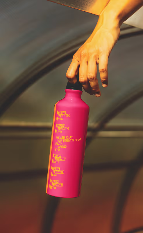
Hand holding a pink water bottle with orange tagline and logos "never out of breath for play grnd syd". Source : Mockup Maison
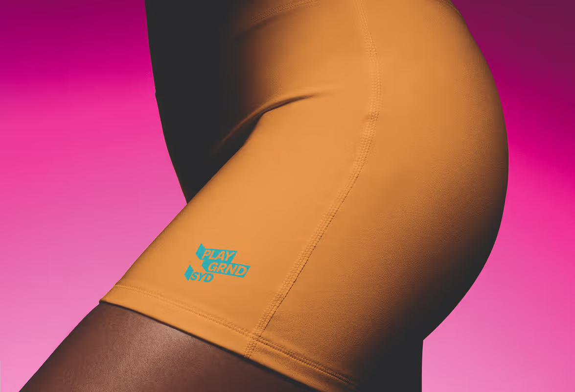
Close up of woman wearing Orange yoga shorts with blue Sydney (SYD) logo near the hem. Pink Background. Source : Mockup Maison
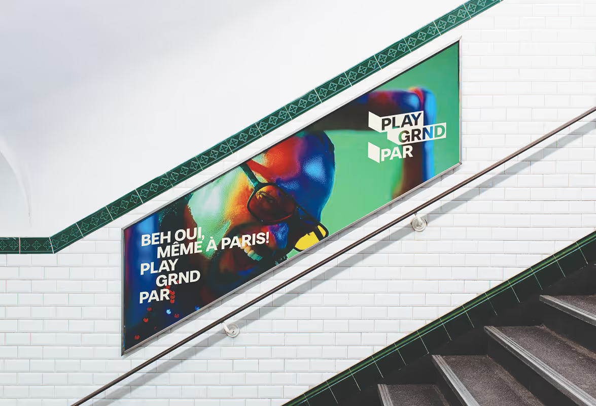
Paris metro add saying "Beh oui, meme à Paris!" (And yes, even in Paris!". Source : Mockup Maison
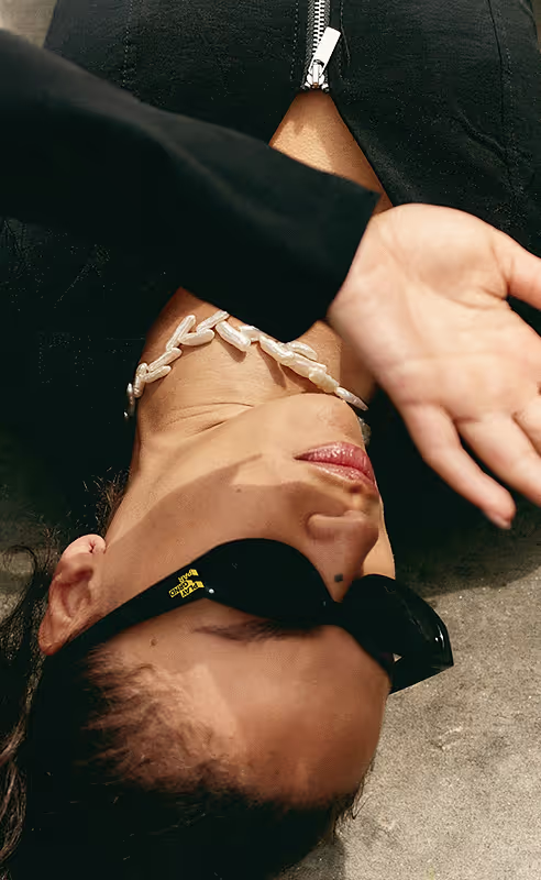
Edited picture of a woman wearing branded Paris (PLAY GRND PAR) sunglasses. Found on Death to Stock "SOFT LUXE" shot by Daniel Farò
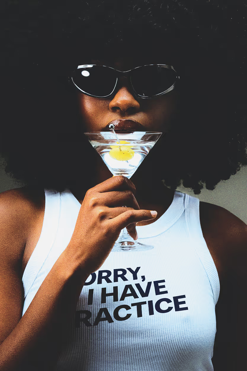
Edited picture of a woman's white tank top with added branded tagline saying "sorry, I have practice." Found on Death to Stock "FIRST ROUND" shot by JELLY LUISE
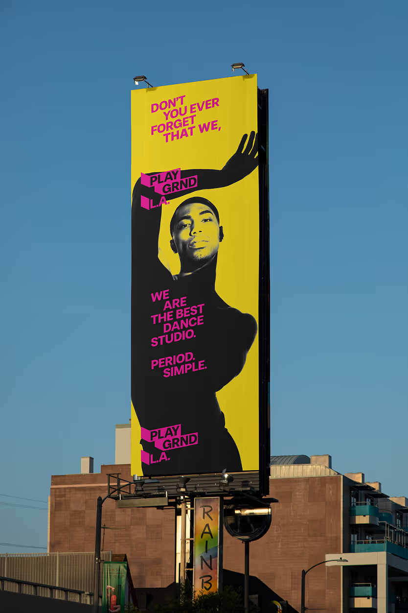
Vertical L.A. Highway Ad Tagline : Don't you ever forget that we, playground L.A., we are the best dance studio. Pink typography, shadowed dancer and bright yellow background. Source : Mockup Maison.
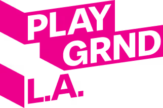
complete PLAY GRND L.A. logo Magenta 100% on white