I HATE [ ]
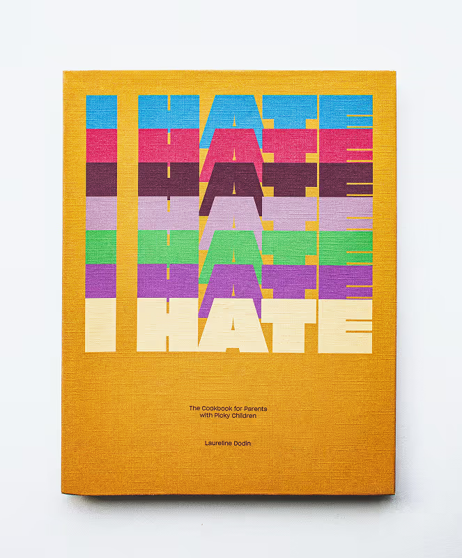
I designed and produced a physical dummy cookbook representing two sections of an original publication.
The goal was to create a cohesive editorial system that balances readability, visual rhythm, and tactile experience while remaining practical for real kitchen use. I chose this topic because it reflects something personal.
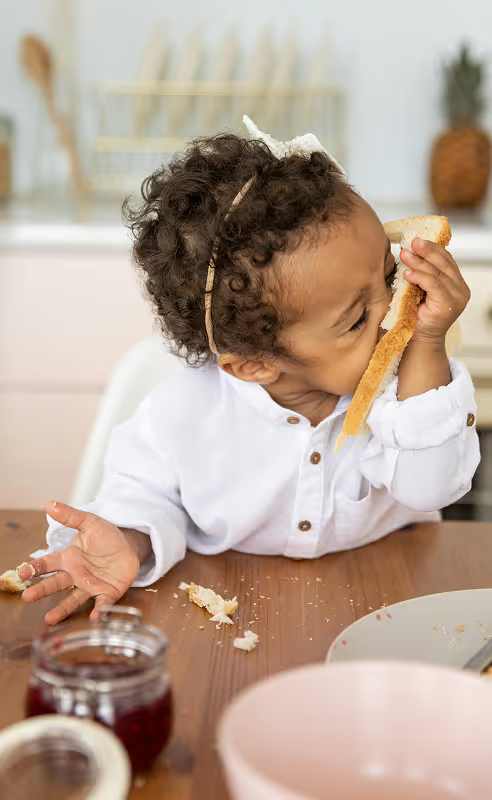
Growing up, my mom loved telling people how not picky I was. When it came to food, I ate everything! That led me to the opposite idea: a cookbook for parents dealing with picky eaters.
![Dark Turquoise Background with white type saying "I Hate [Seafood]" in the center](images/ihate-swatch1.avif)
![Red Background with white type saying "I Hate [Tomatoes]" in the center](images/ihate-swatch2.avif)
![Burgundy Background with white type saying "I Hate [Meat]" in the center](images/ihate-swatch3.avif)
![Taupe Background with white type saying "I Hate [Sauce]" in the center](images/ihate-swatch4.avif)
![Green Background with white type saying "I Hate [Anything Green]" in the center](images/ihate-swatch5.avif)
![Purple Background with white type saying "I Hate [Onions]" in the center](images/ihate-swatch6.avif)
![Mustard yellow Background with white type saying "I Hate [Cheese]" in the center](images/ihate-swatch7.avif)
I HATE [ ] organizes recipes around ingredients children often refuse to eat. Instead of avoiding these foods, the book offers recipes designed to make them more appealing.
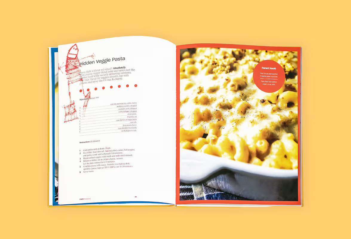
The design prioritizes clarity and speed. Parents cooking under pressure do not have time to read long stories before step one, so recipes are presented in a single-column layout with concise instructions. Small “parent hacks” appear in the corner of each spread, offering quick tips that feel like advice from someone who understands the frustration.
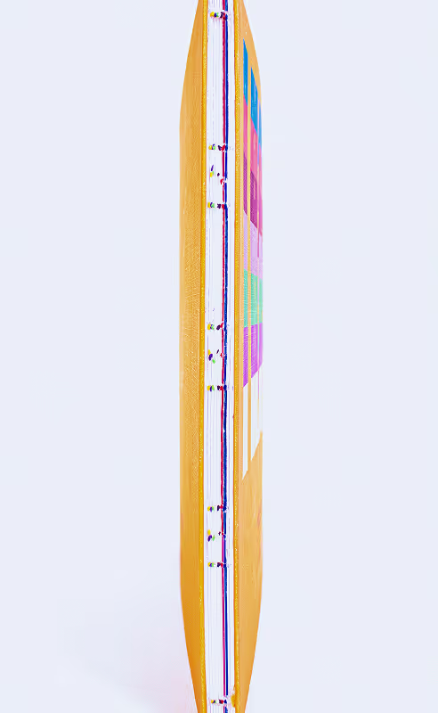
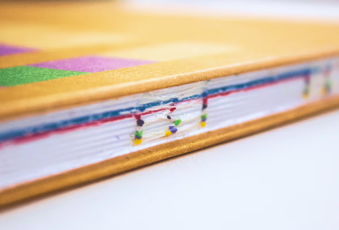
A structured grid system and strong color backdrops create visual rhythm while also producing colored page edges, allowing readers to quickly flip to a specific ingredient section. I bound the book as a hardcover with exposed sewn binding and no spine, allowing it to lie completely flat on a kitchen counter.
Glossy interior paper helps resist stains, while the textured linen cover adds durability and reinforces the slightly gritty, honest tone of cooking for picky kids.
The final result is a fully bound dummy including endpapers, title pages, an introduction, a section opener, and five recipes.

![2d IPad Wireframe of Chicken "Fish" Sticks recipe for the I HATE [Seafood] section](images/IHATE_img7.avif)