Fromages du Terroir
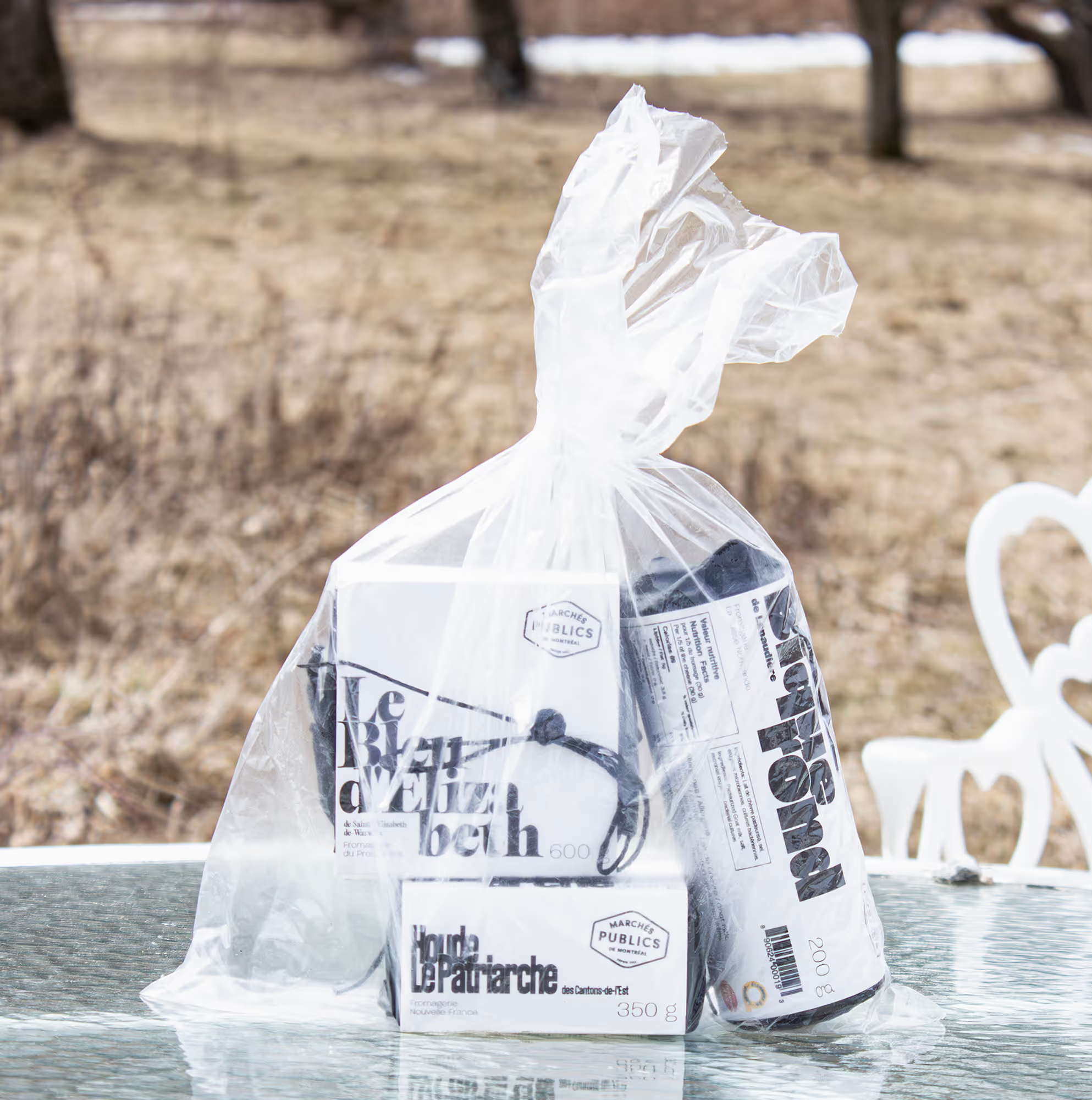
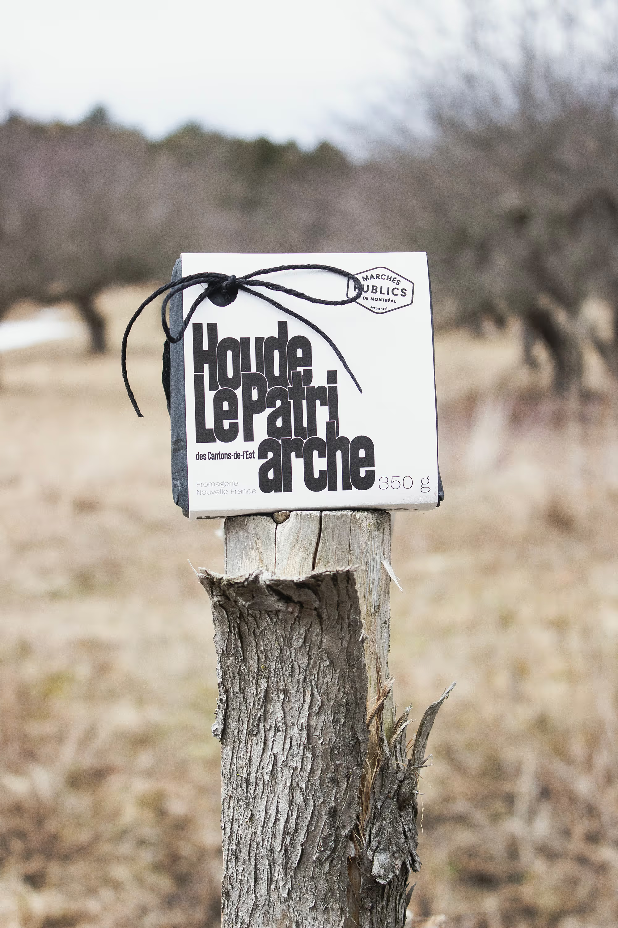
In a hypothetical world, I get asked by Marchés Publics de Montréal to design a terroir-based cheese line for their 2025 pop-up collection. They need a packaging that celebrates local identity while aligning with contemporary consumer values of sustainability, freshness, and artisanal quality.
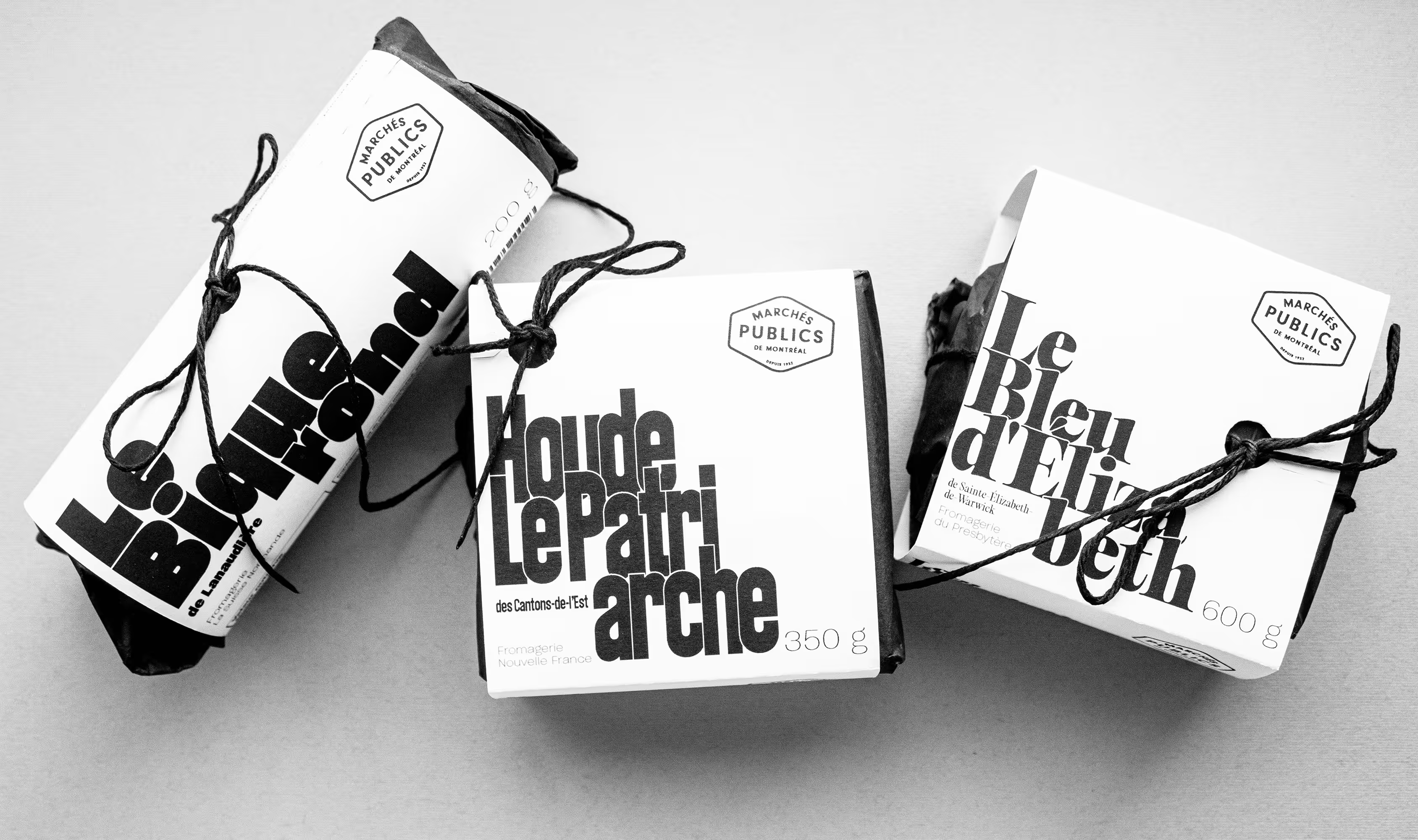
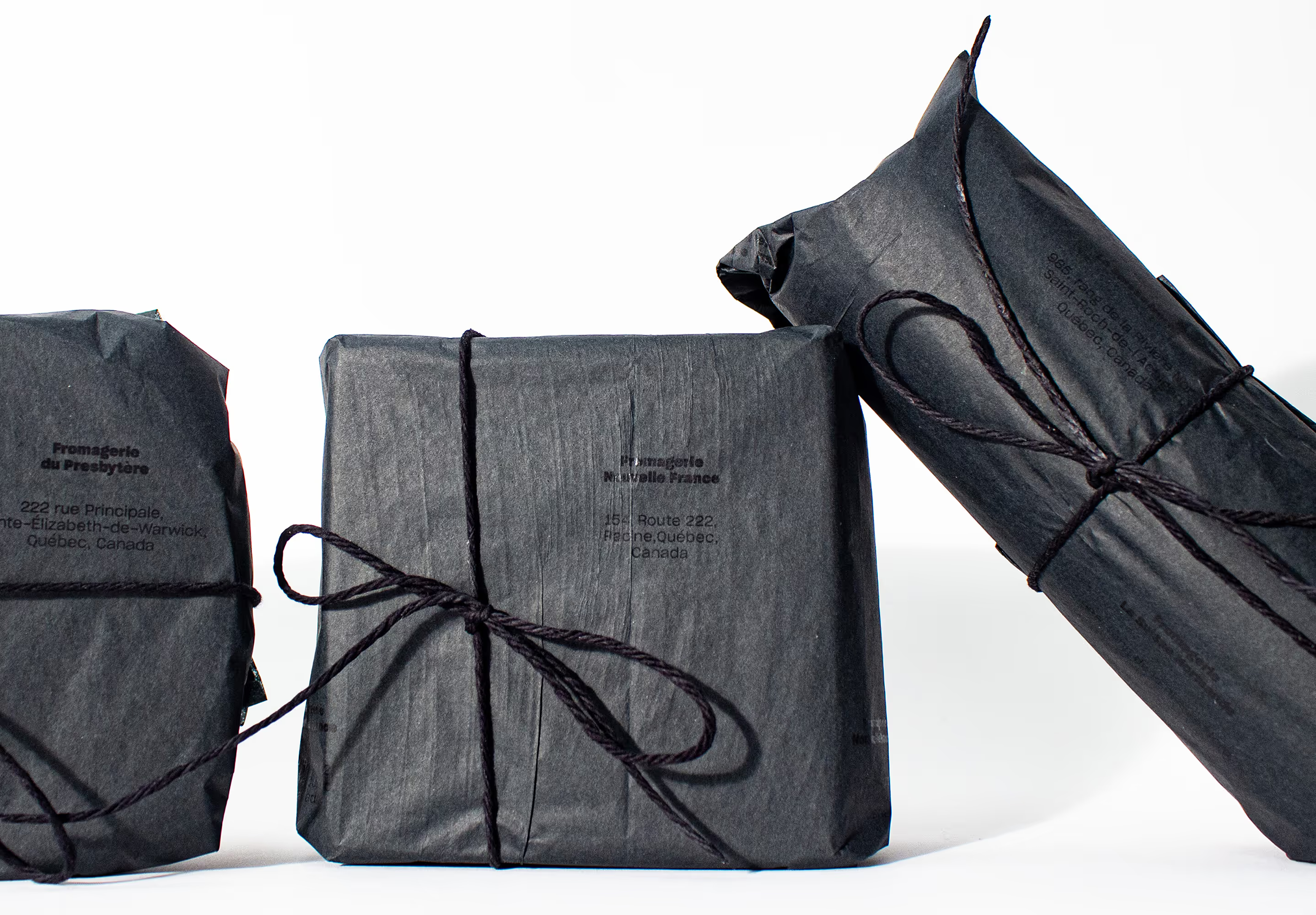
The research phase focused on the relationship between terroir, dairy production, and consumer perception of freshness. I explored visual cues associated with traditional Quebec farms while avoiding overly nostalgic or cliché representations of rural imagery.
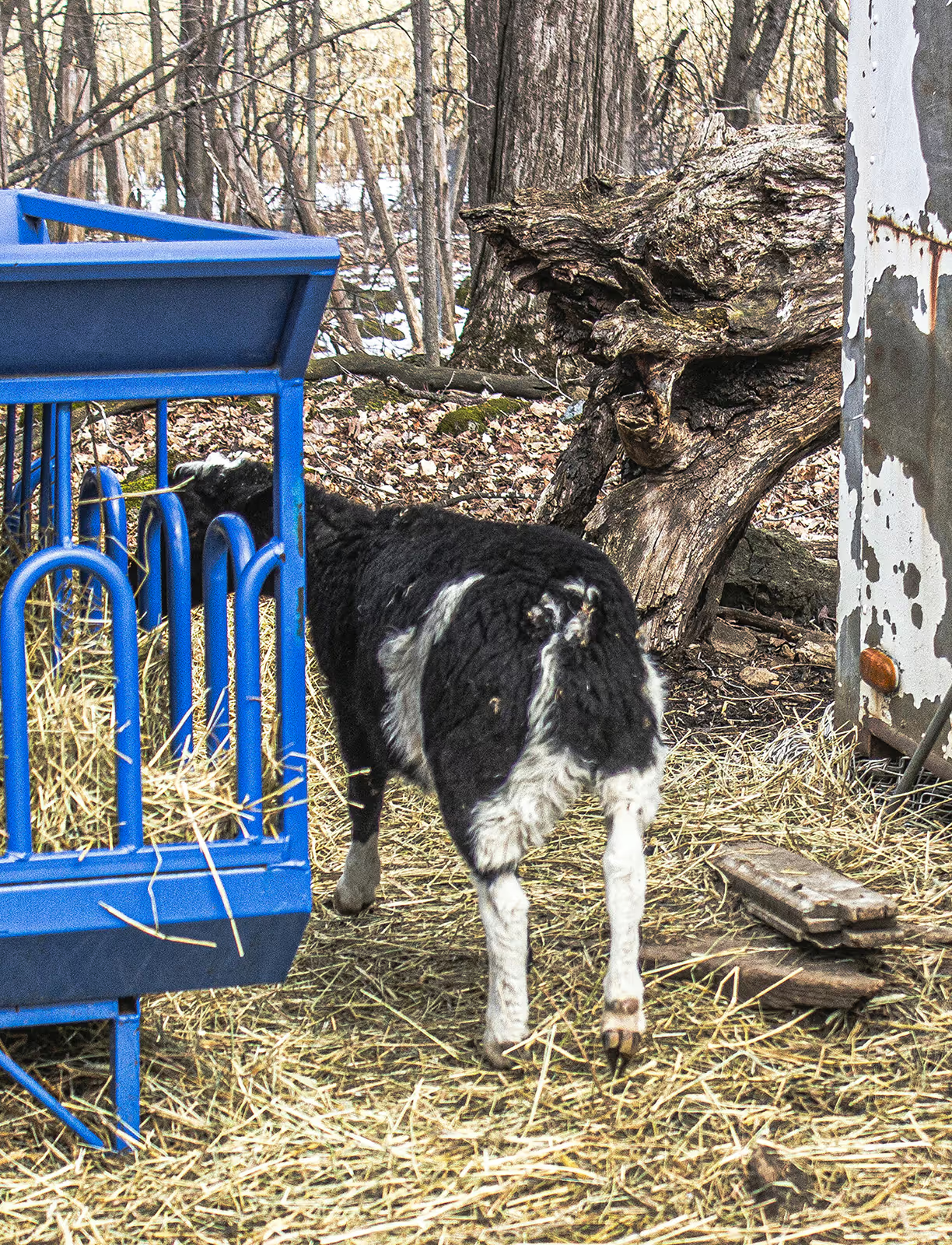
During this stage, I became interested in the role of hay in dairy production. As a fundamental component of cattle nutrition, hay indirectly shapes the flavor and quality of milk. This insight led to the conceptual direction of highlighting an often overlooked element of the production chain: the feed that sustains the animals.
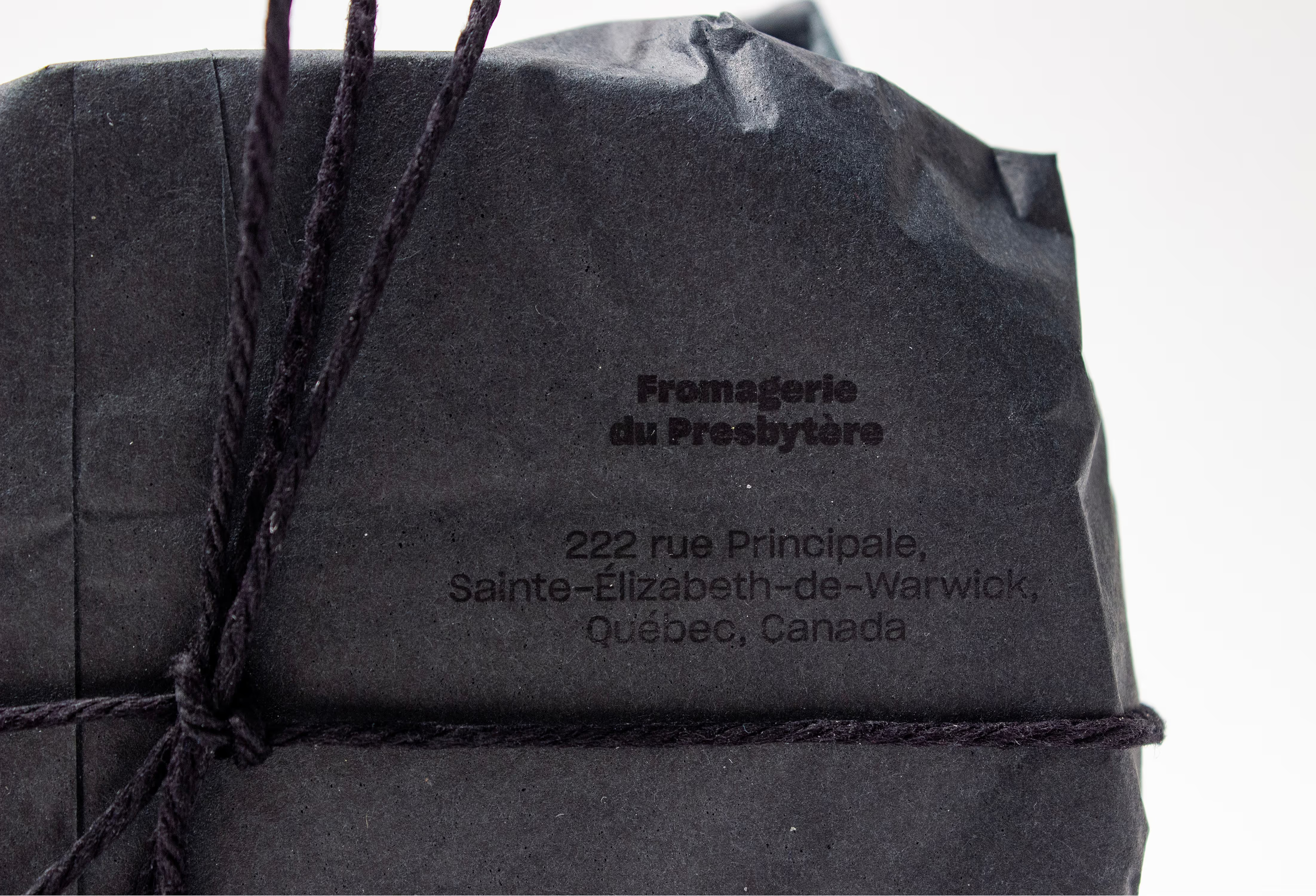
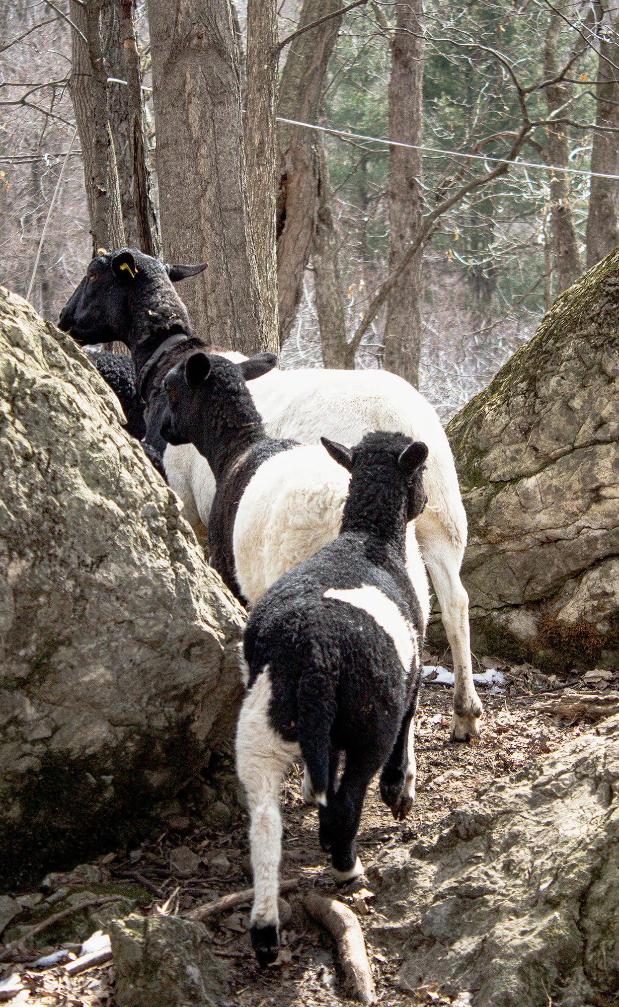
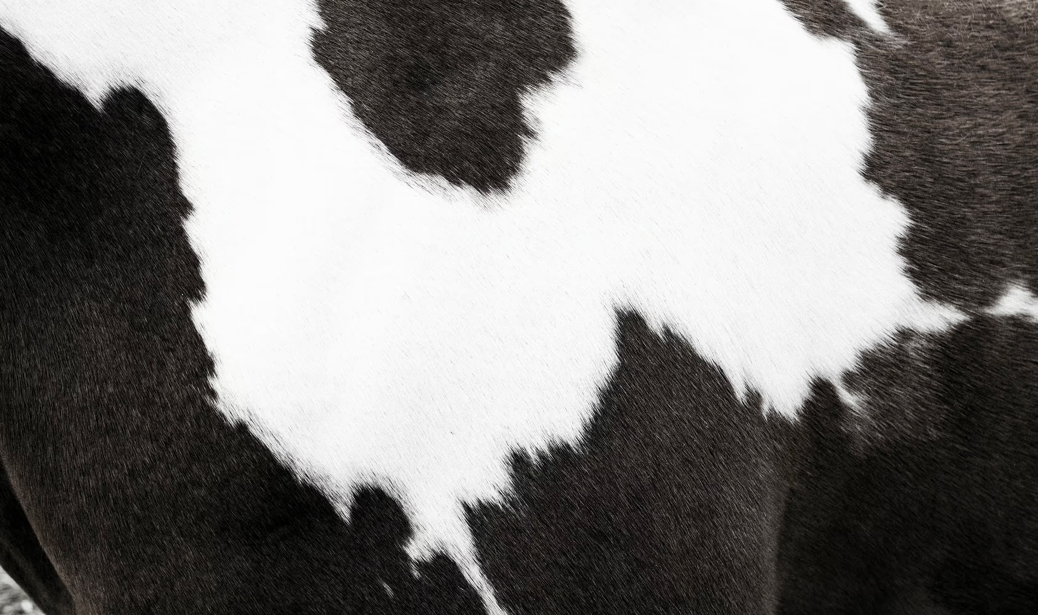
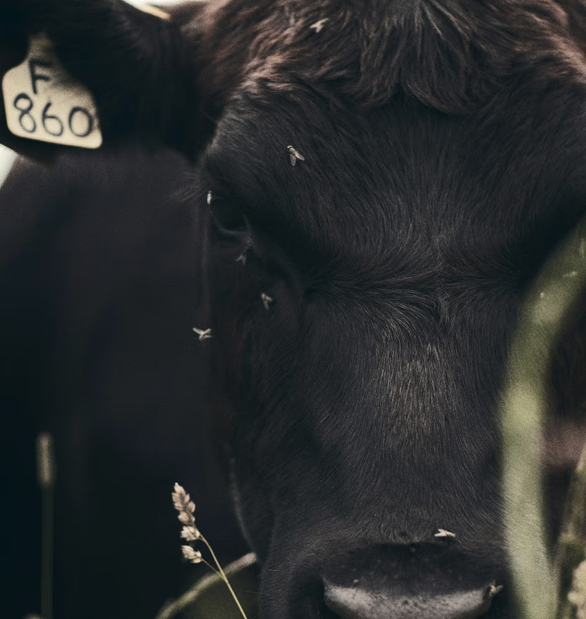
The visual identity is built on a black-and-white color palette derived from cattle coats. The palette serves a functional purpose: darker packaging reduces light exposure, which can cause flavor and vitamin degradation in milk products. Studies indicate that limiting light exposure helps preserve sensory quality and can strengthen consumer perceptions of freshness.
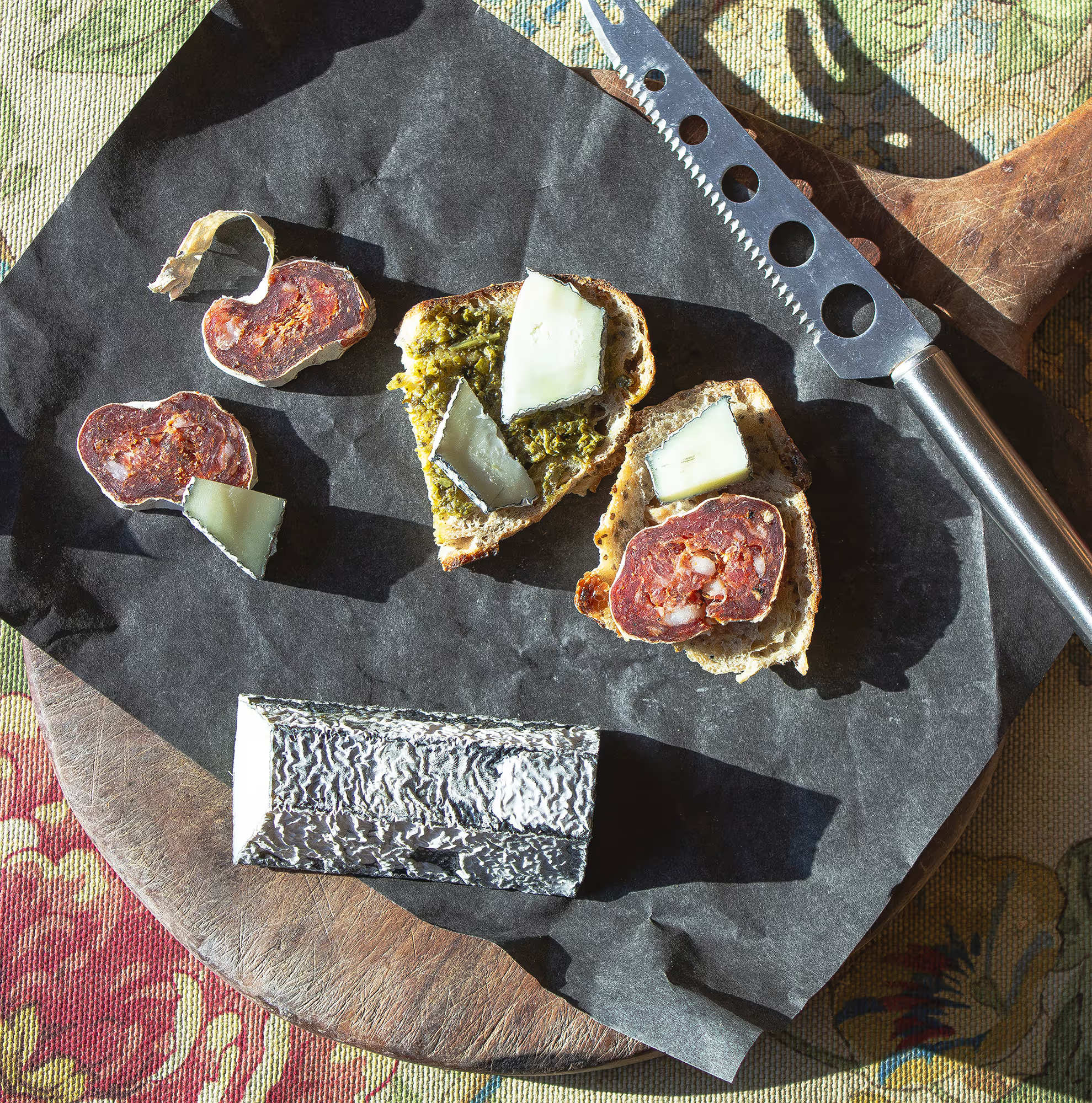
The final result is a distinct packaging system that balances conceptual storytelling with practical considerations. By linking the product to the agricultural process behind it, the design highlights the connection between dairy farmers, cattle, and the local terroir.